
Gen Z FinTech App
Doni Inc.
Doni is an application that seeks to help people, particularly Generation Z, source and gather contributions from their networks, so that they can achieve their financial goals more quickly. It also serves to teach members of Gen Z best financial practices. They accomplish this by offering features to advertise goals, events, and wishlists to the user’s network. The product is fully functional, but the company was interested in getting input from UX designers, to ensure their product would be successful with their target audience. An abridged case study can be found below - for the full case study, click here.
Client /
Doni
Role /
Project Lead
Year /
2017
The Objective
Doni would like to optimize their existing app as well as adopt new design features to ensure their app is successful with Generation Z. Success is defined in terms of user engagement, satisfaction, return rate, and recommendation to others.
The Goal
Conduct user research and usability testing to identify pain points in the existing app. Use these insights to make design changes that will increase the success and popularity of the app. Prototype and test design features with users to validate.
The Skills
Remote Team Communication, User Research, Usability Testing, Research Synthesis, Iterative Design Process, High-Fidelity Prototyping
Heuristic Evaluation
We conducted an heuristic evaluation to acquaint ourselves with the Doni app. In order to keep our biases clear of this analysis, we used Jakob Nielsen's set of heuristics for user interface design, as follows:
1) Visibility of System Status
2) Match Between System & Real World
3) User Control & Freedom
4) Consistency & Standards
5) Error Prevention
6) Recognition Rather Than Recall
7) Flexibility & Efficiency of Use
8) Aesthetic & Minimalist Design
9) Help Users Recognize, Diagnose,
& Recover From Errors
10) Help & Documentation

Below are some examples where Doni failed to meet the heuristic standard:
Issue
Heuristic Violated
Severity
Notes /
Recommendations

What does the heart
icon mean on
My Goals?
#1 - Visibility
2
It’s unclear what the heart icon
means on any specific goal.
Recommend defining the icon
somewhere in the app, or
changing it to something more
intuitively clear.

“Hey” pop-up when
creating a custom
occasion while creating
a new event.
#8 - Aesthetic
2
"Hey" with no punctuation
seems clumsy and misplaced
for the task. Could be
misconstrued as aggressive.
Suggest dropping “Hey”
all together - verbage on
Android is more appropriate.
Having done this analysis, we had an idea for what Doni was doing well and what needed improvement. We would only begin designing on our observations if they were validated by users during testing. However, the results of the evaluation were still useful for consideration on our part, or that of the client.
User Research
Survey
To get a better idea for how Generation Z functions as a whole, we created a survey using Google Forms, and distributed it to our personal networks to garner responses from age-appropriate people. We asked questions such as:
- How do you save money for an expensive item you’re interested in?
- Who would you ask for contributions to a goal item?
- How much control do you want to have over the gifts you receive?
How much control do you want to have over the gifts you receive?

Respondents /
23
Age /
14-23
We learned that most people want control over their gifts.
Do you and/or your friends plan special occasions for one another?

And that people do plan events for one another
We also discovered:
- 87% would ask their family for contributions
- 65% would ask their friends for contributions
- Of those who plan events for one another, many use some sort of text or online
communication to plan
Overall, the data from the survey validated Doni’s strategy, showing that Gen Z has an interest in controlling their gifts, they will almost certainly source their close network for contributions, and they also use a platform similar to Doni’s to coordinate events for each other. Given this research, Doni should be able to capitalize on Gen Z’s goals, as long as they can keep users engaged.
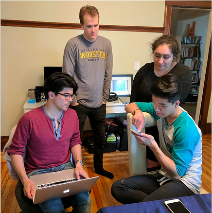
Usability Testing
We tested the existing Doni app with 4 participants:

Fernanda

InHang

Luckas

Reyner
First, we asked general questions about the participants’ backgrounds. This helped us to contextualize them as well as put them at ease before the test. Additionally, with a few questions we were able to prime the participants for the experience they were about to have. Example questions were:
- Do you do anything outside of your studies?
- What activities do you use your smartphone for?
- If you could get any product right now, what would it be?
We then asked participants to perform several tasks:
- Sign Up
- Create an Event
- Create a Goal
- Create a Wishlist
As they performed each of these tasks, we collected both qualitative and some quantitative feedback regarding their experiences. Quantitative questions were on a scale of 1-7, and included:
- How relevant was this task for what you normally do?
- How easy or difficult was it for you to perform this task?
- How satisfied are you with the app after performing this task?
After they completed the tasks, we asked them a few questions about their
overall experience with the app:
- Overall, how satisfied are you with the application? (Scale 1-7)
- What are one or two things you like about the app?
- What are one or two things you disliked about the app?
- Is there anything missing that you would like to see?
Key Findings
Overall, participants liked the app, and found it to be potentially useful. While most had difficulty with the flow the first time, as they performed a few tasks they found it became easier.

“Hard the first time, easy the second time."
~ Reyner
The Good
The Bad
- Liked signing in with Facebook
- Liked the color scheme
- Liked the idea of fundraising with their network
- Liked being able to see who donated the money
- Unclear wording - ie. “Recipient”
- Desire for a Home Screen
- Savings slider was unclear
- Desire for goals with longer limit than 3 months
- Desire for photo feature
Research Synthesis
Affinity Map
Given all the data we gathered from the survey and usability testing, we began to extract meaning from the chaos by placing our findings into an affinity map.

After organizing our data into this map, we found several features that users were interested in:
- Home Screen
- Tutorial
- In-App Notifications
- Video Recording/Sharing
- Direct Messaging
- Sharing of contributions on social media
- Clear Verbiage
- Plan Further in Advance than 3 Months
- Automatic Contributions
- “Friends” feature for the app
- Special Characters in Text-Entry Fields
Problem & Solution Statements
As our design target coalesced, we developed problem and solution statements to conceptualize who we were designing for. We used a Gen Z persona provided to us by Doni.
Problem Statement
As a young adult who wants to save for expensive products instead of making many inexpensive purchases, I need a way to combine my network’s resources so that their generosity is put to the best use.
Solution Statement
Restructure the existing app to allow for Gen Z users to clearly express and brand themselves as they raise funds to achieve their goals, all the while developing their existing networking skills.
Sketching & Ideation
Design Principles
As a means to keep our design process on course, we devised a handful of principles to keep in mind as we sketched and wireframed:
1) Keep the user connected with friends
2) Engage user with multiple functions
3) Allow user to express identity through functions of the app
4) Keep it clear and simple
5) Help users reach their goals faster
Design Studio
With those principles to guide us, we did a team design studio, in which we chose a feature and:
- Individually sketched ideas - 8 Minutes
- Presented & critiqued ideas - 15 Minutes
- Sketched & refined a complete solution - 8 Minutes
- Presented & critiqued solutions - 15 Minutes
- Converged on a single solution - 10 Minutes

This strategy was very effective, as it allowed each team member to work independently to come up with a clear idea, and then take advantage of others’ input at intervals to build out those ideas and make them better and more complete. We were able to get the best of both worlds in terms of individual inspiration and team collaboration, and using a timer ensured we made the best use of our time.
Usability Testing Iteration Nº1
Paper Prototype
Combining all our wireframes, we created our first paper prototype and began testing.

Usability Testing
We tested three participatns with our paper prototype, using the same method as the first testing round:

Fernanda

Liz

Danielle
We found that users would not be deterred from using the app because of the 3.5% transfer charge, but they felt like they should have been informed of it earlier in the app.
“Woah, I thought you were trying to help me out - now I see what you’re doing.”
~ Liz

Key Findings
- Users wanted an option to send a personalized message when sharing their events or goals.
- Use of “Title” in lieu of “Recipient” in Events was more clear.
- Confusion on the nature of an event - who the event is for.
- Confusing to have “Ask for Wishlist” on event, even if the event is for the user.
- Desire for preview/edit option on the video function.
- Desire for option to take pictures or write descriptions, in addition to the video.
- Regarding the repeat contribution, users wanted a calendar so they could see exactly when the contribution was scheduled to come out.
- Even when users understood they price slider, they did not fine it useful.
Usability Testing Iteration Nº2
Taking user feedback into account, we shifted our wireframes into digital format in gray scale, and configured them into flows in a prototype on InVision. We then tested this prototype on an iPhone with 2 users, using the same testing method as previous tests:
Fernanda

Luckas
The tutorial pop-up that we incorporated for onboarding users was easily skippable, but present to inform those who would learn that way.
“I’m the kind of person who would go around and see how things work to figure it out - I’m not the person who would read the instructions.”
~ Luckas
Key Findings
- Remove “Past” from Friend’s project page
- In Wish List function, change “Add Goal” to “Add to List”
- Differentiate this action from “Create Goal”
- In contribution page, add (?) icon next to “recurring” to define the term
Having gathered another round of feedback, we were able to apply the necessary changes as we transitioned into our third, high-fidelity prototype. Due to time constraints, we were unable to test this prototype with users.
Evolution of the Screens
Price & Savings Screen
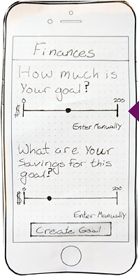
All users preferred to
enter the monetary
values manually, rather than use the slider

Users wanted to be
informed of the 3.5% surcharge earlier, so we
placed it on this page, and added a calculator.
The validity of the calculator feature would be tested in the next round of user testing.

Main Features Added
Home Screen

Users expressed a desire for a home screen to help orient them within the app.
From this screen, users can:
- Make a quick contribution to a friend’s goal
- See a list of their friends in the app
- Observe how much money they have raised, compared to others
- This gamifies the app, introducing a competitive aspect
- See a quick summary of users own goals.
Pop-Up Coaching Screens

A learning curve to understand the app’s function was one of the biggest roadblocks and frustrations for first-time users. However, each user understood the app’s functions by the end of the usability testing.
Since the learning curve was not too steep, we opted to design an easily escapable tutorial function in the form of pop-up screens.
The feature was validated by user testing, as those who needed it found it clarifying, and those who did not were able to quickly exit and learn by doing.
Friends/Profile Feature

As a means to keep users connected with their friends on Doni, and as a natural progression from the self-branding profile page, we designed a Friends feature within the app.
Per user request, we removed an option to see friends’ past events and goals, because they did not think it was relevant information.
Video/Photo Capture
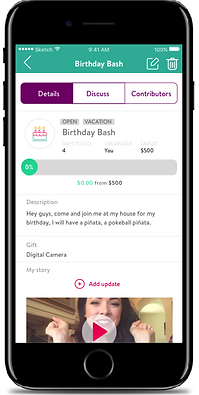
To keep the user engaged and allow them to truly brand their events and goals, we designed a video/photo feature that could be shared with their networks.
We called it “My Story,” drawing from the lexicon of other social media. This choice was validated by our users, as they understood its meaning immediately.
Through user testing, we found that a (+) icon was not clear enough to indicate an option to make another video, so we clarified this with the addition of “Add Update,” a choice which was validated by our users.
Conclusions
Given a reasonably broad task, our team began interviewing members of Gen Z to learn how they saved, how they spent, and how they felt about the app in its current form. Through user research we found that there were some clarity issues in the app, regarding wording and feature function. We also discovered the users’ desire for a more engaging experience, through which they could express themselves and their goals more faithfully.
To make the app more clear, we changed the wording of a few components and added a short and skippable pop-up coach window to explain the main features. To make the experience more engaging, we introduced a video/photo feature to events and goals, which could be shared on multiple social media outlets. We also introduced an in-app friends function which would allow users to see friends’ activities and communicate directly through Doni. The features were all validated by users, with some minor adjustments to each that we made throughout the iteration process. By our last prototype, users were almost certain to return to the app, and to recommend it to others. Once they understood the utility of the app, they found it fit seamlessly into their goals and behavior.